Redesign JOOX Music APP
JOOX is a global music product serving China,Southeast Asia (Thailand, Indonesia, Malaysia),
and South Africa, achieving over 200 million downloads.
App Redesign (iOS, Android)
I orchestrated and executed the redesign of the JOOX music app, resulting in over X million daily active users within its first month, with a remarkable 40% increase in click-through rates on the ME page.
Type
Overview
Jun - Dec 2020 (6 months)
Timeline
Senior UI/UX Designer
Role
User Research, UI/UX Design, Design System
Responsibilities
Background
Why Redesign?
Since its launch in January 2015, JOOX built a music-centered entertainment ecosystem within five years.
However, hastily launched features have led to
significant monthly user attrition and underwhelming retention rates.


JOOX 5.0 DAU Data
January February March
New Users
Old Users
Old Users
Drop-off
4x
5x
6x
7x
JOOX 5.0 Version
Note: Due to the company's confidentiality agreement, I cannot share exact core data.
UX Challenge
Most users were dissatisfied with the music experience and struggled with new features.
Most users' negative feedback centres on their dissatisfaction with the core music consumption experience and their struggle to explore JOOX's additional features.
Aom
Students (Thailand)

"I find it difficult to quickly locate the content I'm looking for because there's too much here, and it all looks quite similar."
Sandie
Designer (Malaysia)

"Sometimes, I try to play music, only to realize it's a karaoke track. I didn't even know JOOX had karaoke features."
Anak Agung
Students (Indonesia)

" I feel that the design of the player is very unreasonable. I can't even adjust the progress while listening to music."
JOOX aims to offer diverse service for users, such as music, karaoke, live, etc.
Business Goals
Music
Live
Karaoke
Video
Radio
Social
Music
76%
17%
7%
Others
Karaoke
76% of users only listen to music during their leisure time, work time, or while commuting.
User Expectations
JOOX strives to be a pan-entertainment platform,
yet 76% of users primarily use it listen to music.
We hope to promote user return to JOOX through diversified features, such as karaoke, video and other new features, but user data shows that 76% of users still only listen to songs.
Business Challenge
Key Insights
User Interview
We engaged with target users to grasp their concerns and needs.
A detailed user research plan was targeted for our core persona between the age group of 18-25,
we conduct the research with the local product teams across 2 countries (Thailand and Indonesia) .
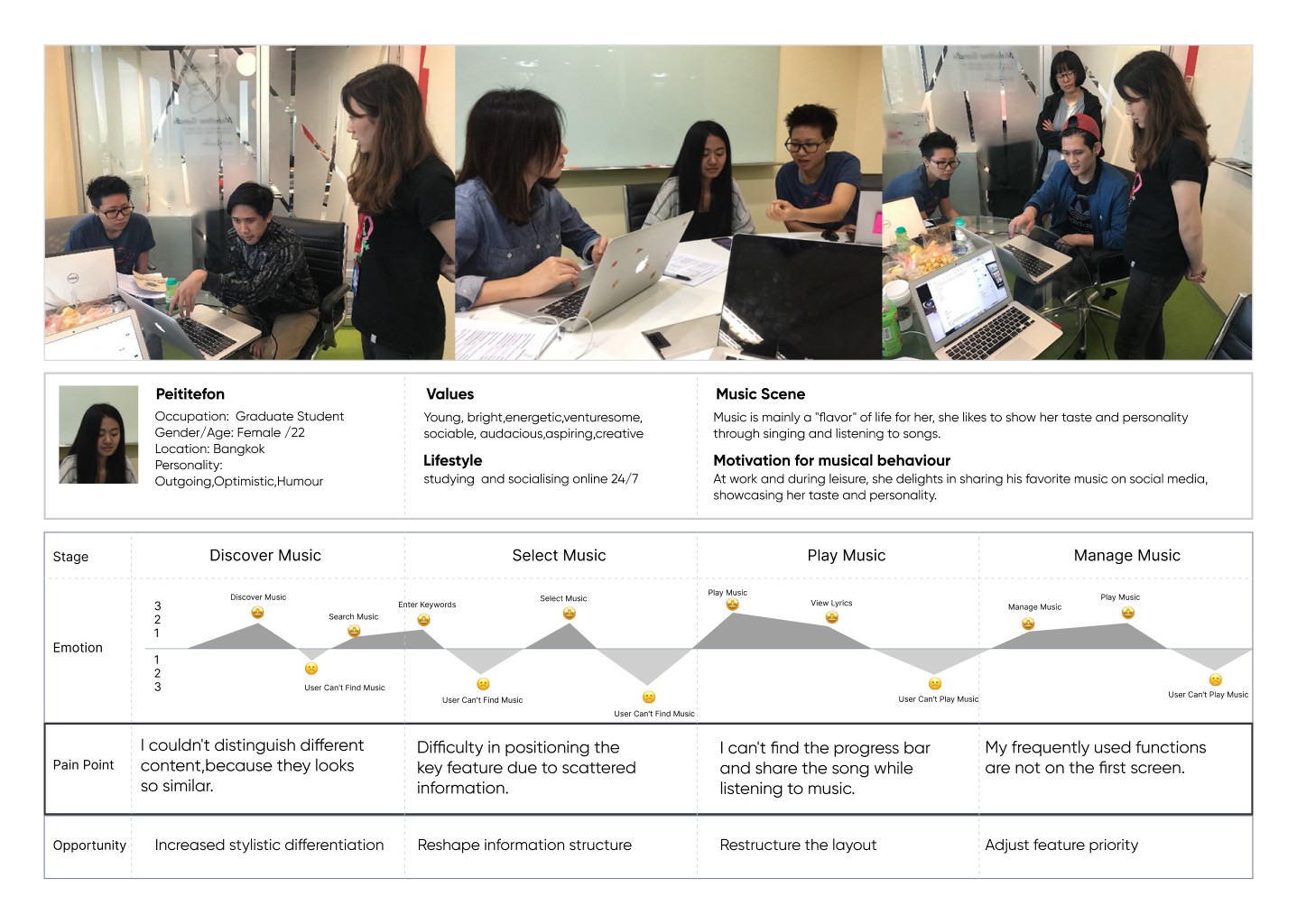
Play Music
I can't find the progress
bar and share the song
while listening to music.
Select Music
Difficulty in positioning
the key feature due to scattered information.
Discover Music
I couldn't distinguish
different content, because they looks so similar.
Manage Music
My frequently used functions
are not on the first screen.
Define Problem
It is difficult to find and play music quickly.
We gathered the Information from the user research and defined experience issues
on the core path of music consumption.

Identification difficulties
Discover Music
Difficult to distinguish
features and contents

Play Music
Unreasonable Visibility
Key features are not visible
on the current page
Select Music
Unreasonable layout
Difficulty locating
key features quickly
Manage Music
Unreasonable Priorities
Feature priorities does
not match user habits
DAILY MUSIC

22.75%
12.13%
7.83%
0.99%
2.64%
26.33%
11.48%
15.75%
Hypothesis
Balance business and user experience.
If we enhance the identification of different features and recommend them in a more reasonable way, users may be more willing to try them.
01
Promote user re-engagement
Boost user retention
If we create a more effective way to listen music, users will find their favourite content easily and quickly.
02
Design Thinking
Brainstorm solutions together
We involved all teams to discuss the root of the problems and brainstorm the solutions,
including the product team, marketing team, tech team and design team.
We finally confirm the priority of information for different pages.


Design Exploration
Create a more effective way to
listen to music and try more
We redesign the interface based on the four principles:
1.Differentiate styles 2. Restructure Layout 3. Enhance Visibility 4. Differentiate priorities

Differentiate styles
Increased
stylistic differentiation
Discover Music

Restructure Layout
Divide clear functional
and information areas
Select Music
Enhance Visibility
Display necessary features and
reduce unnecessary page jumps
Play Music

Differentiate Priorities
Adjust feature priority
based on user usage data
Manage Music
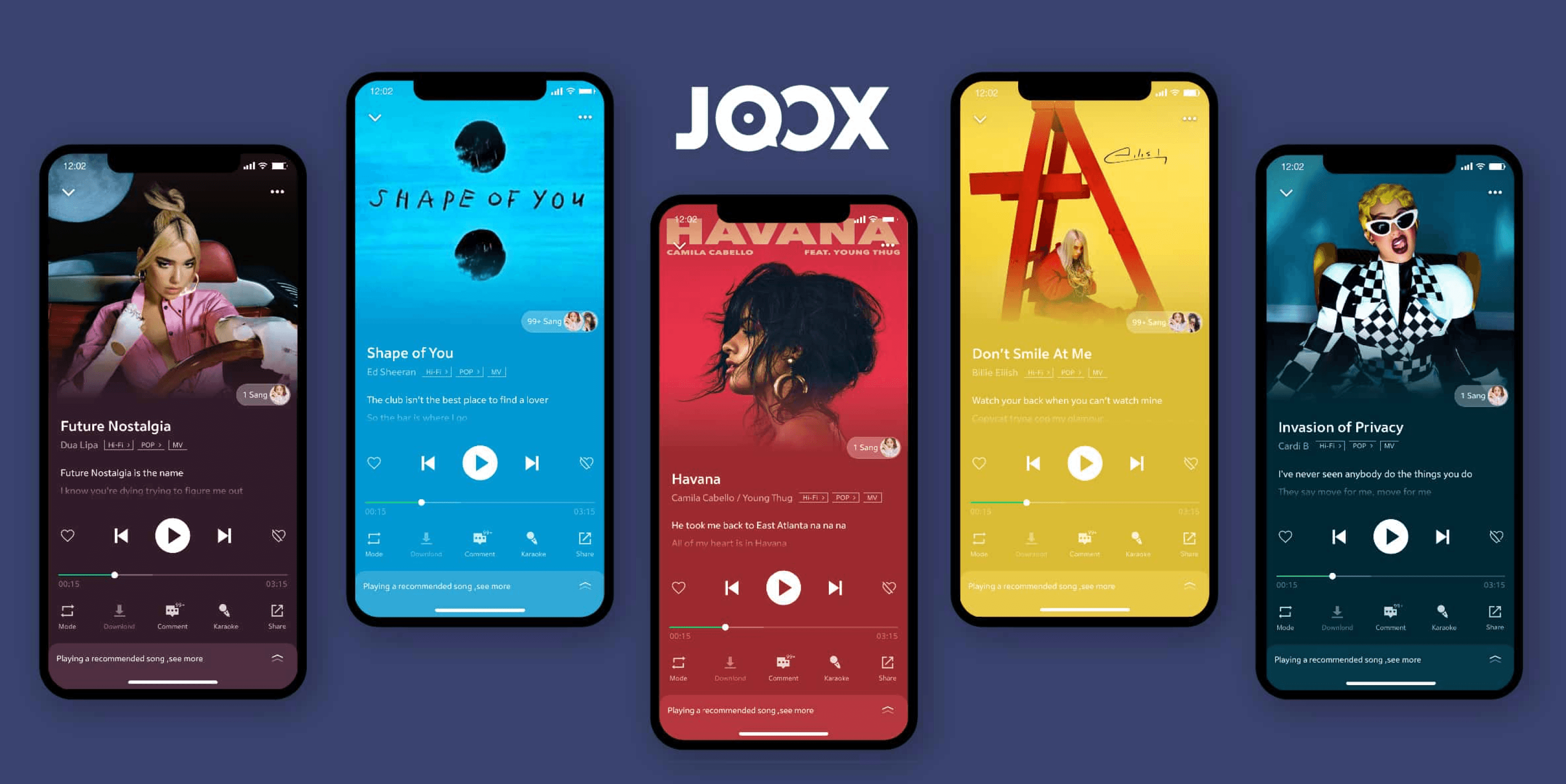
Final Design
Enhance perception of multiple service types and improve core experience
Differentiate Styles
Discover Music
Tab
Enhance the recognizability of Tabs in text form,
allowing users to quickly identify different Tabs.
Features Icons
Use different colors and graphics to distinguish
feature icons, allowing users to perceive multiple service.
Contents
Strengthen the style distinction to help users quickly identify different contents.

Restructure Layout
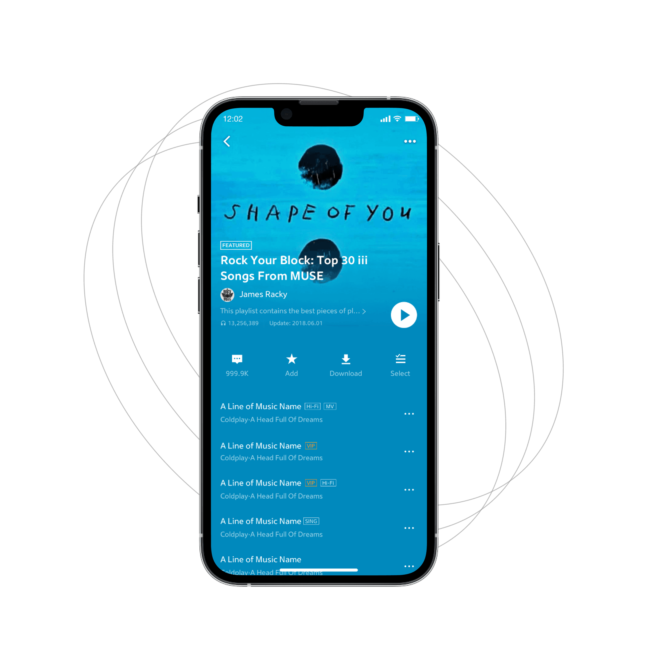
Select Music
Picture Area
Integrate album cover and artist information into the picture area for easy viewing by users
Feature Area
Integrate all functions in the same area to facilitate users to find and operate, such as Play,add,download, etc.
Information Area
Display song information in list form to facilitate user reading.
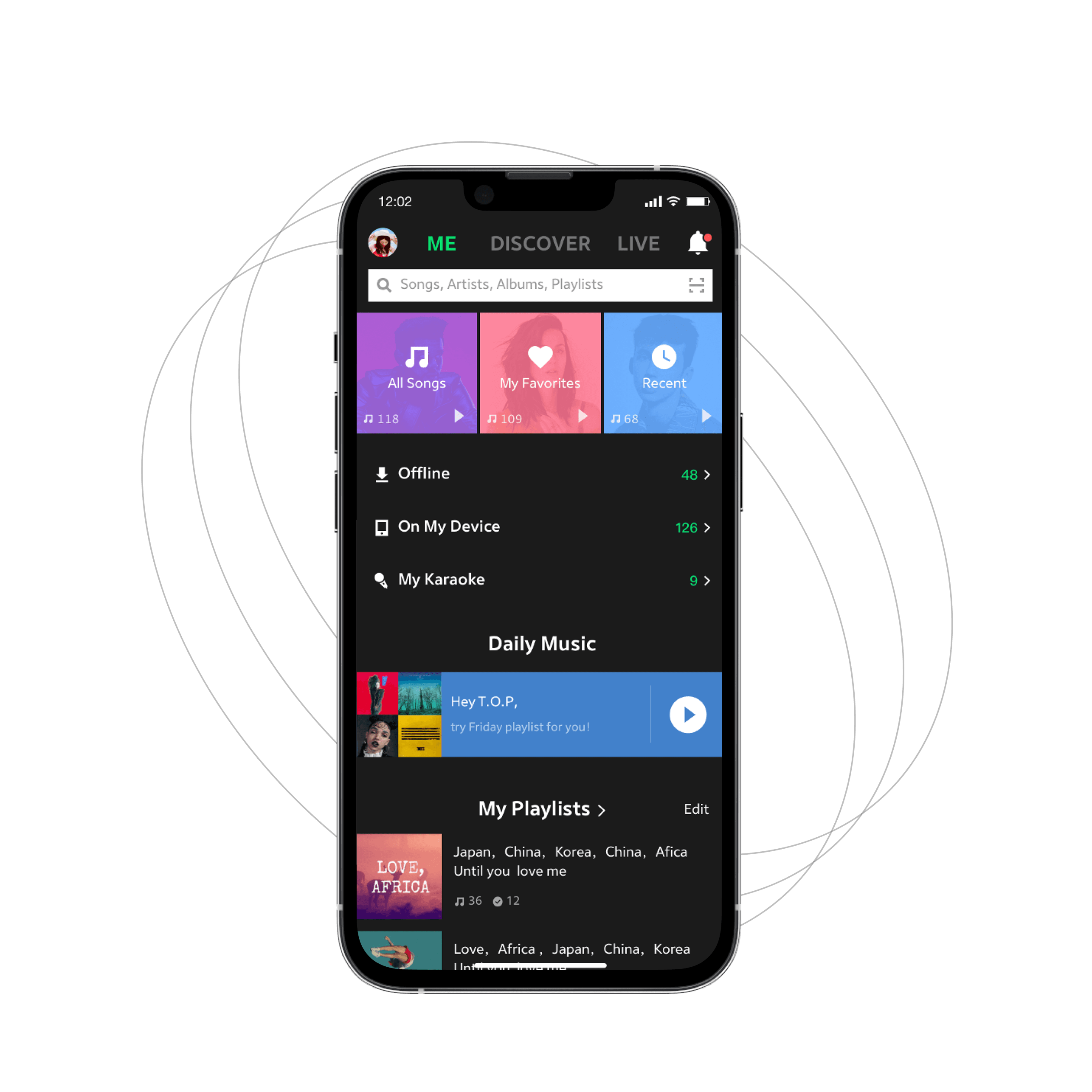
Differentiate Priorities
Manage Music
High-priority features
Emphasize users' high-priority functions through card-style design, allowing users to quickly identify and operate.
low-priority features
Weaken users’ low-priority features through list-based design.
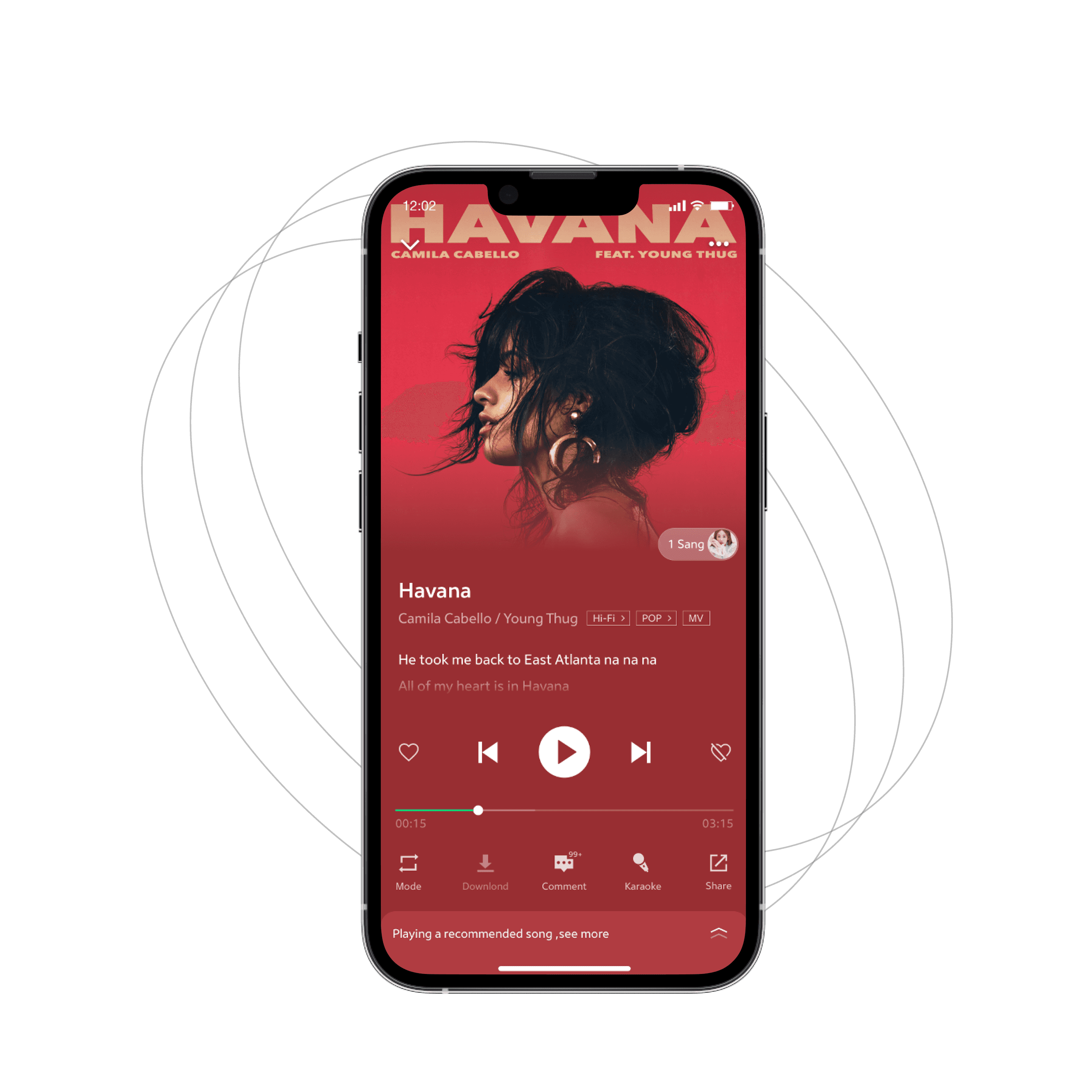
Enhance Visibility
Listen Music
icons
Display all necessary Features on the current page to reduce users from jumping to other pages.
Recommended content
Recommend Karaoke content through a more reasonable approach to encourage users to try more.
Other Contents
Other content is hidden in the drop-down menu at the bottom, and users can view it based on their personal needs.
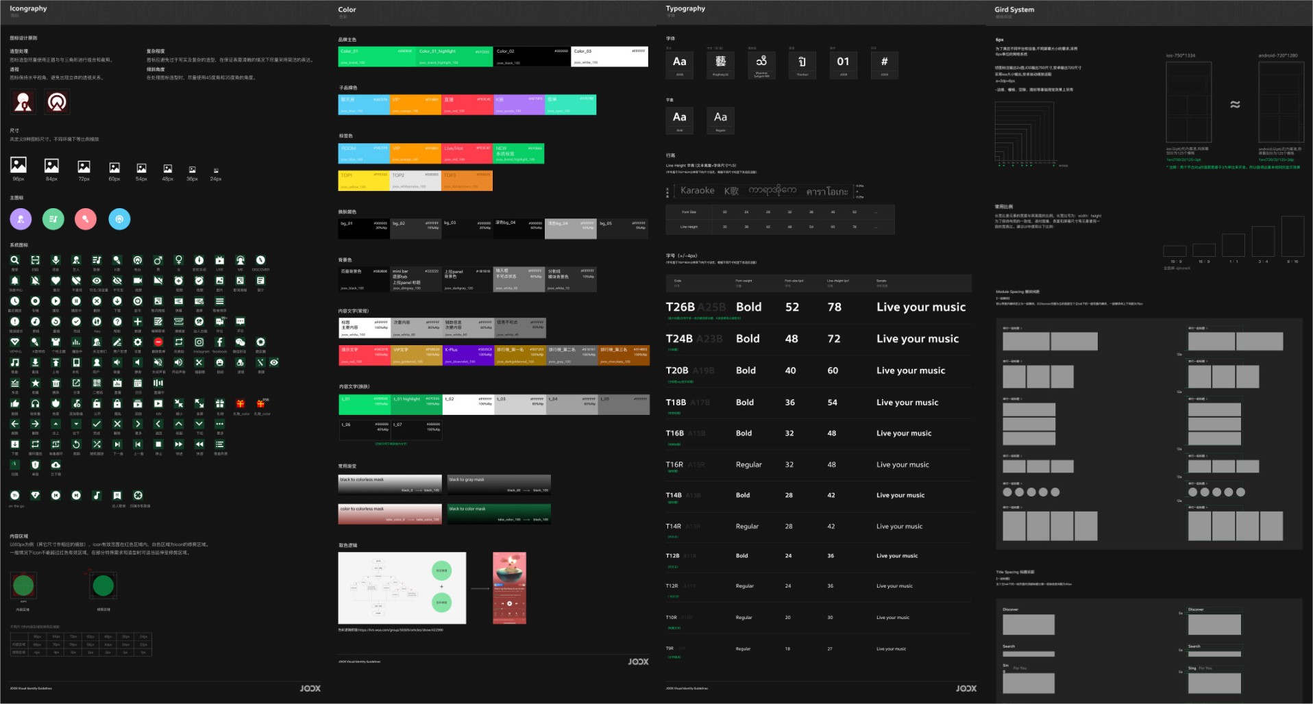
Design system
Keep consistency by establishing a robust design system
In order to maintain the design consistency of the overall app,
we created a design system, including icongraphy, color, typography, gird system, and so on.


Imapct
Positive results
We ultimately achieved a very positive result with this redesign.
Data on the core path of music consumption has significantly improved.
22%
Discover Music
Daily Active User
13%
Select Music
Daily Active User
15%
Listen Music
Retention Rate
40%
Manage Music
Daily Active User
Thanks for reading!